模块安装
1、下载dashboard以后放在插件目录。
2、pip install -r requirement.txt。
3、重启ODOO,刷新ODOO应用列表并安装。
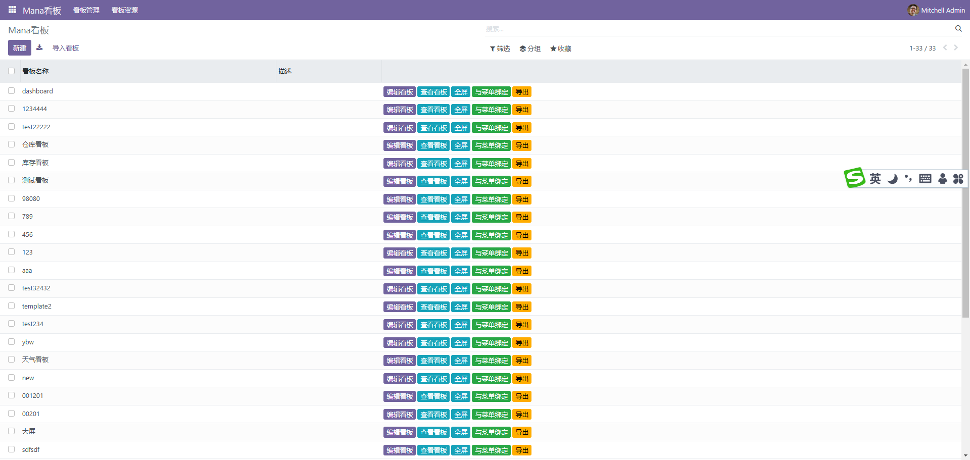
创建看板
点击新建按扭,创建dashboard。完成后返回列表

1、点击编辑进入编辑模式。
2、点击预览进入预览模式。
3、点击绑定菜单,将编辑好的DASHBOARD绑定到菜单。
4、全屏,全屏预览。
5、导出,导出模板。
界面预览
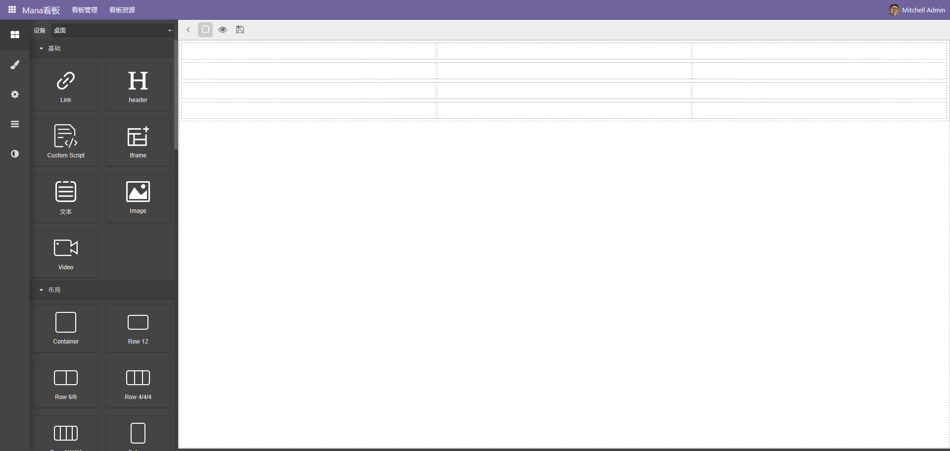
编辑布局
编辑布局一般使用布局区块进行布局
布局使用bootstrap的网格布局,如果需要水平放置元素使用flex row组件,纵向使用flex column组件。
 可以通过嵌套实现复杂的布局效果
一般情况下,为了更好的体现区块效果,会选择拖动卡片到布局中
单个调整好以后通过复制按扭复制到其它网格,这样可以保持样式统一
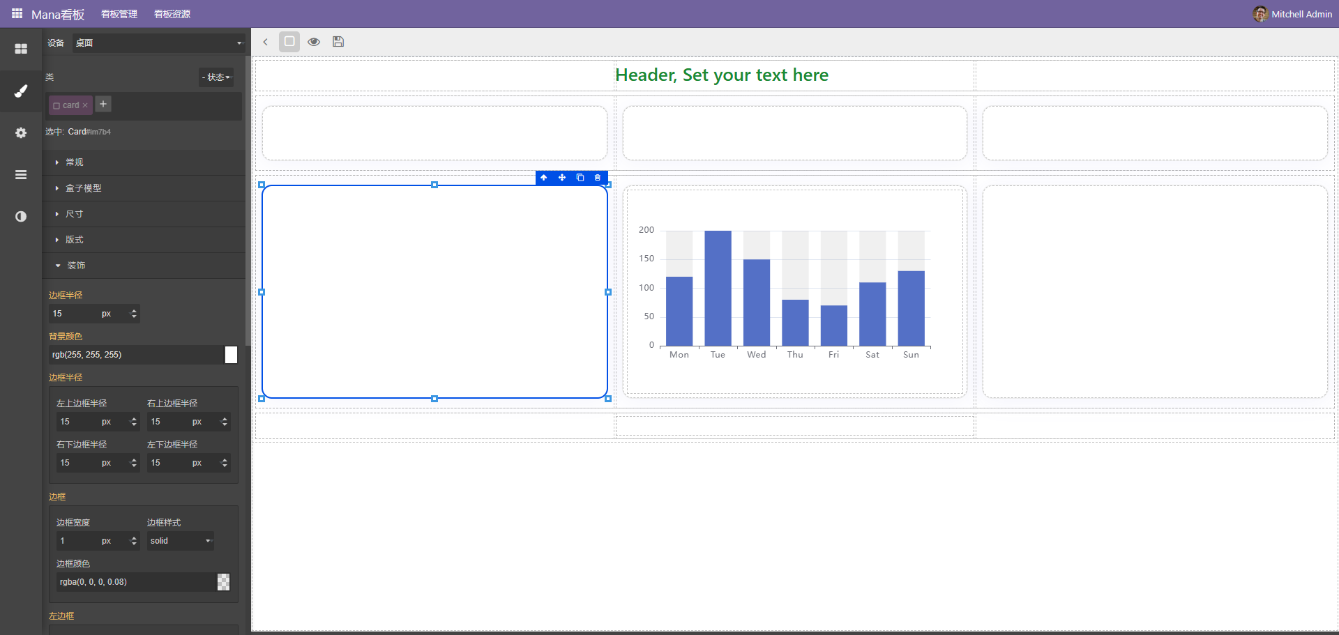
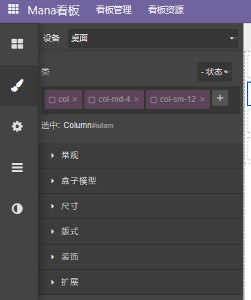
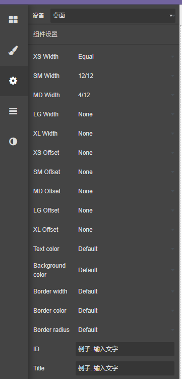
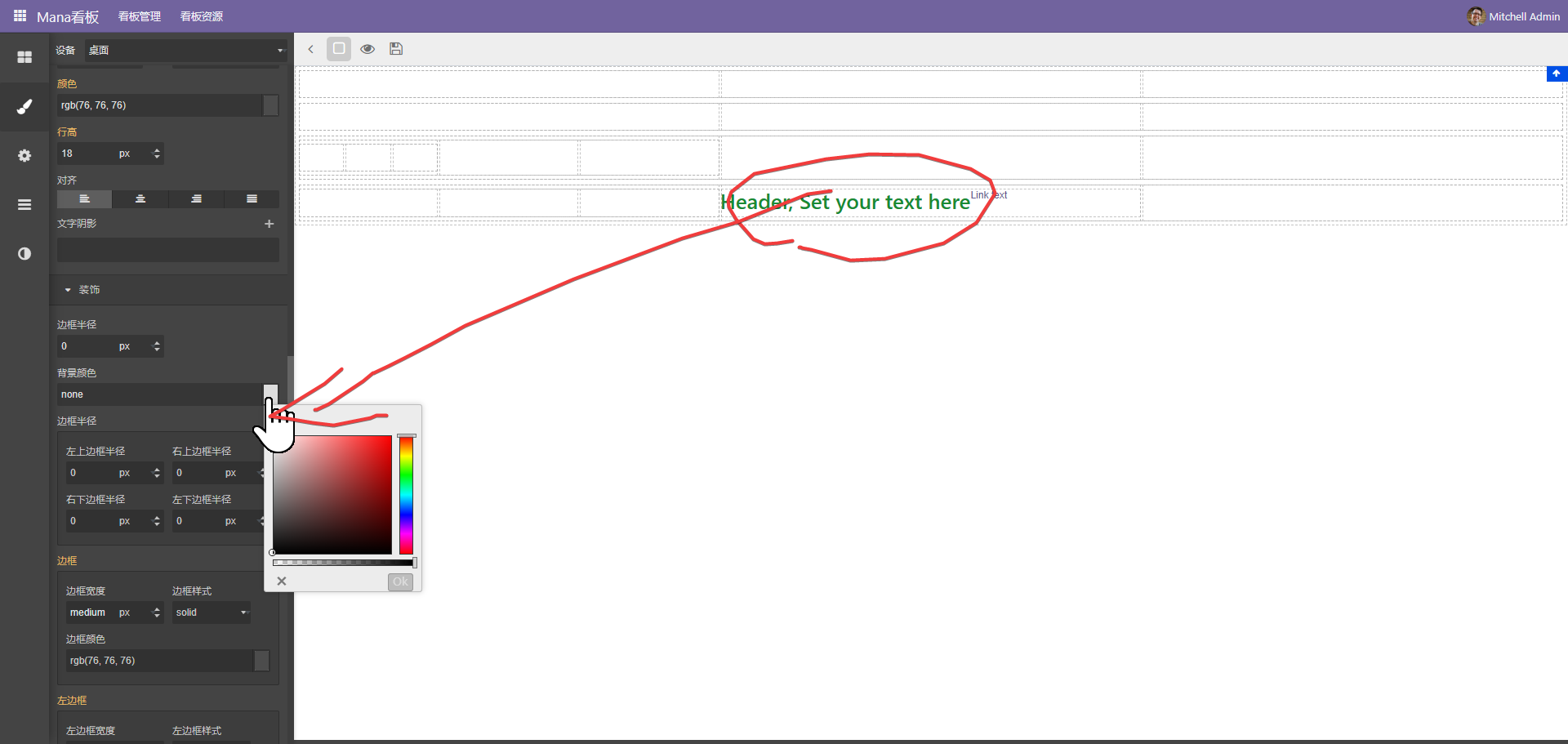
更改样式
选中元素后,在左侧通过样式面版调整区块样式
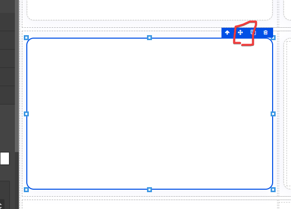
编辑工具栏
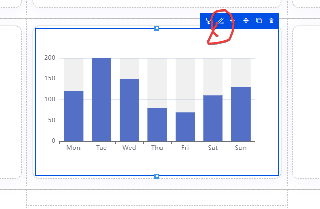
远中元素后会自动弹出编辑工具
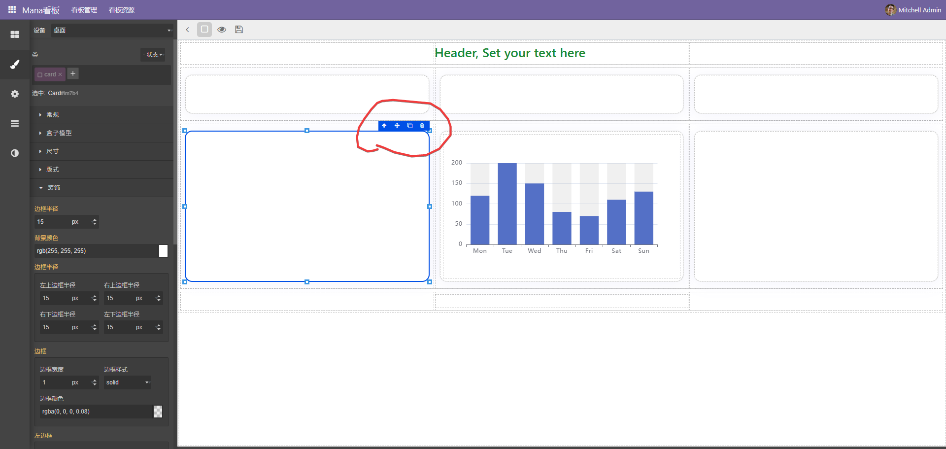
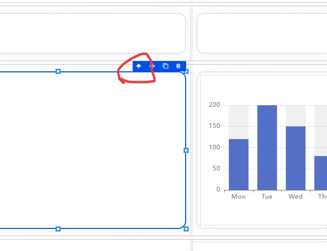
2、十字箭头移动元素。
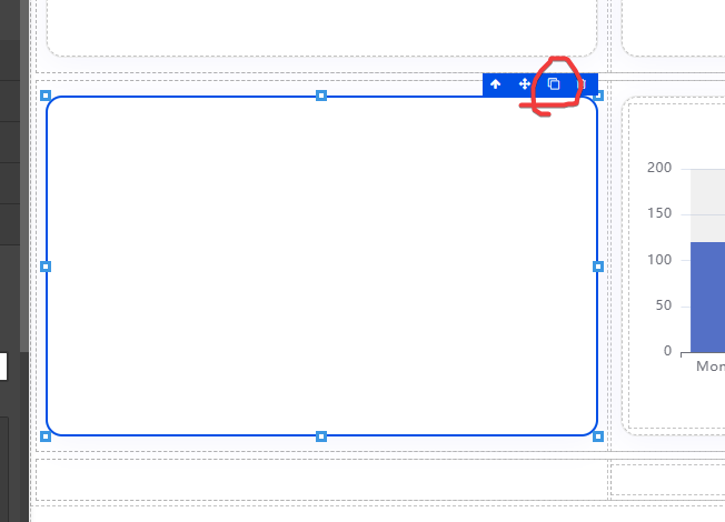
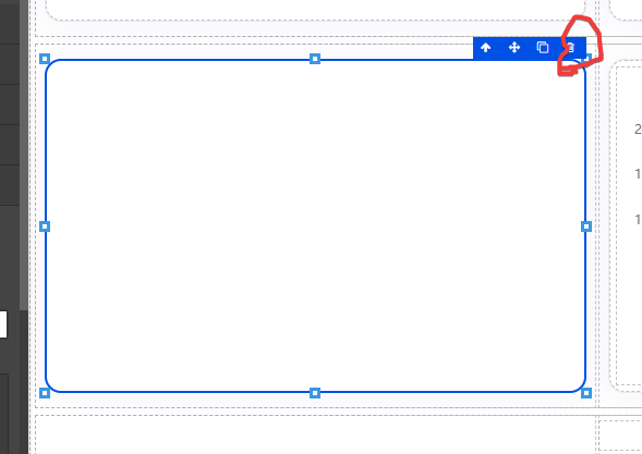
5、一些元素有自己特定的编辑按扭,如图表会有配置按扭。
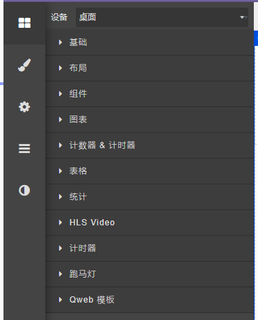
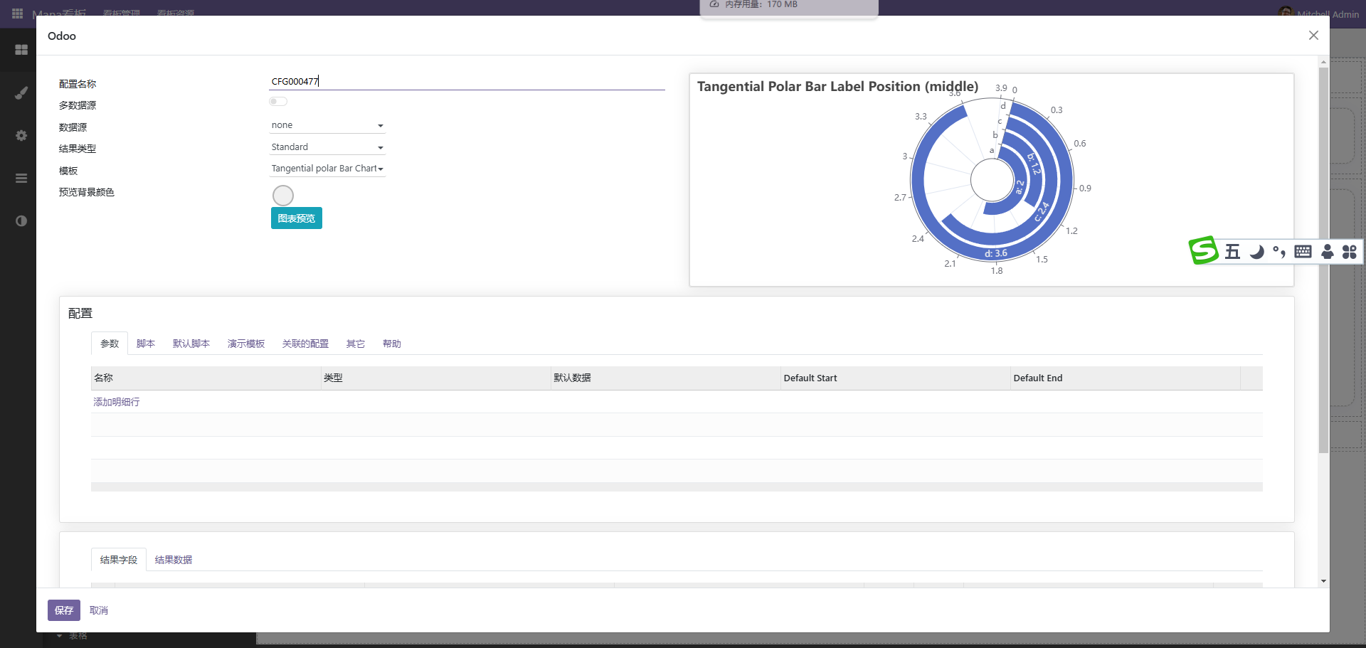
添加图表
图表是开发中必不可少的元素
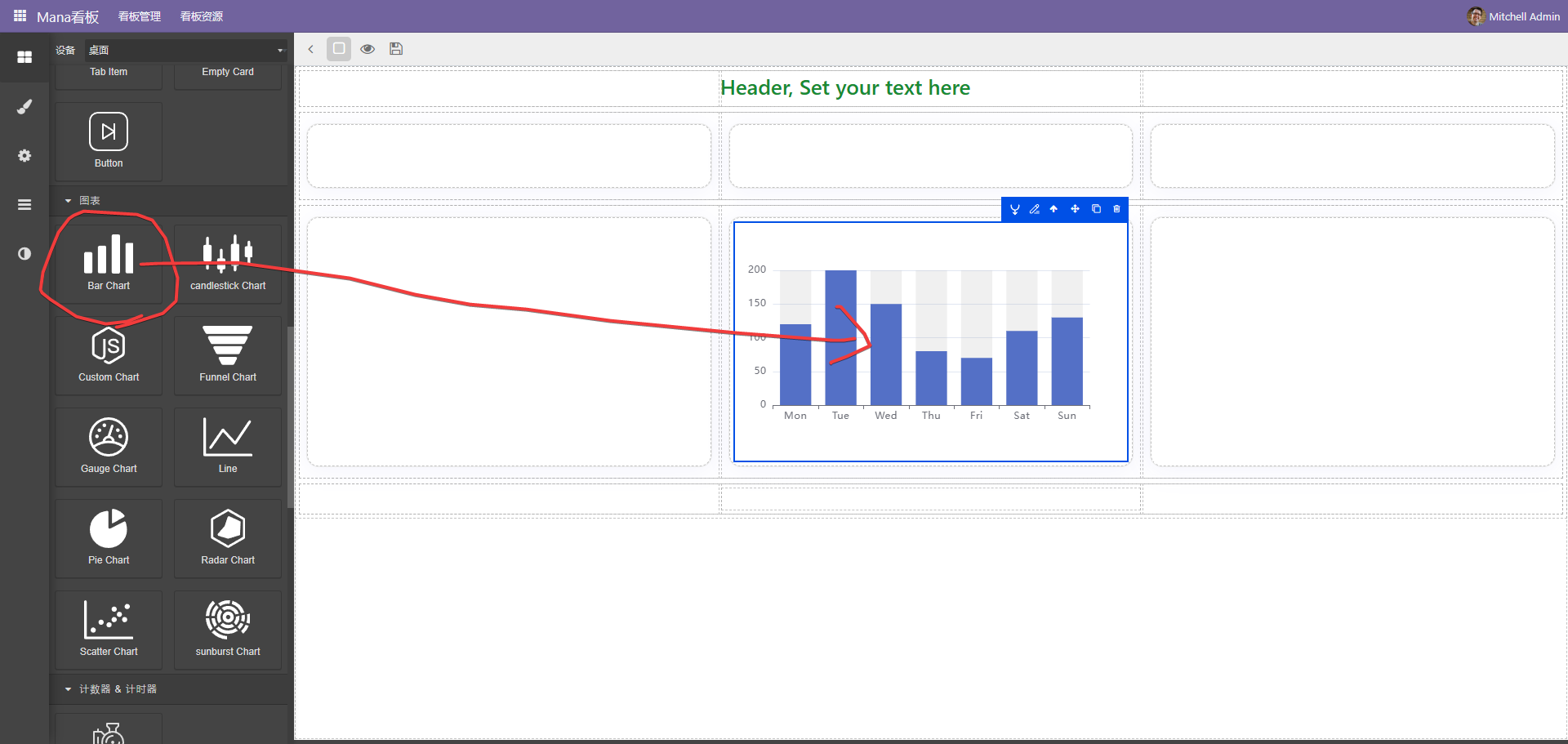
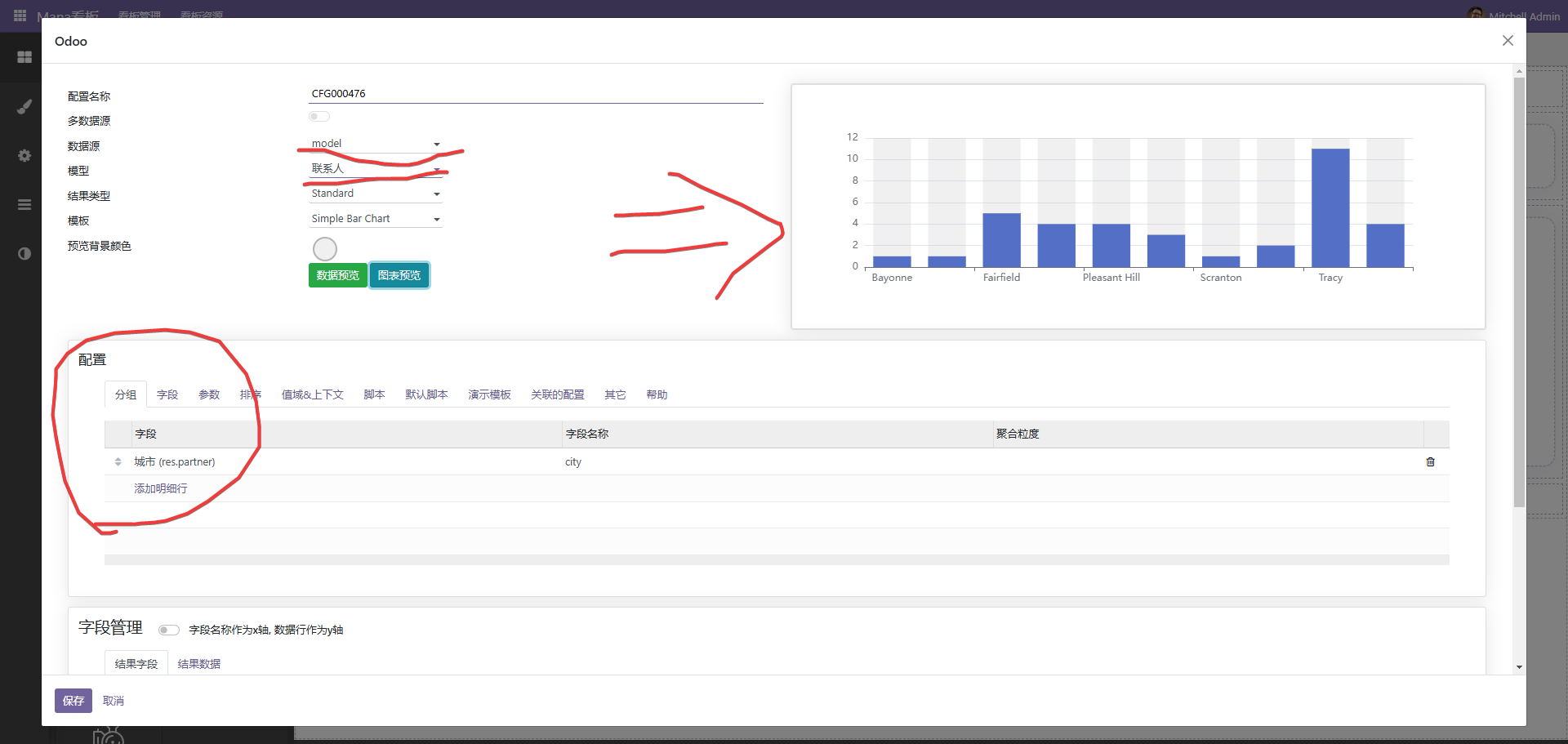
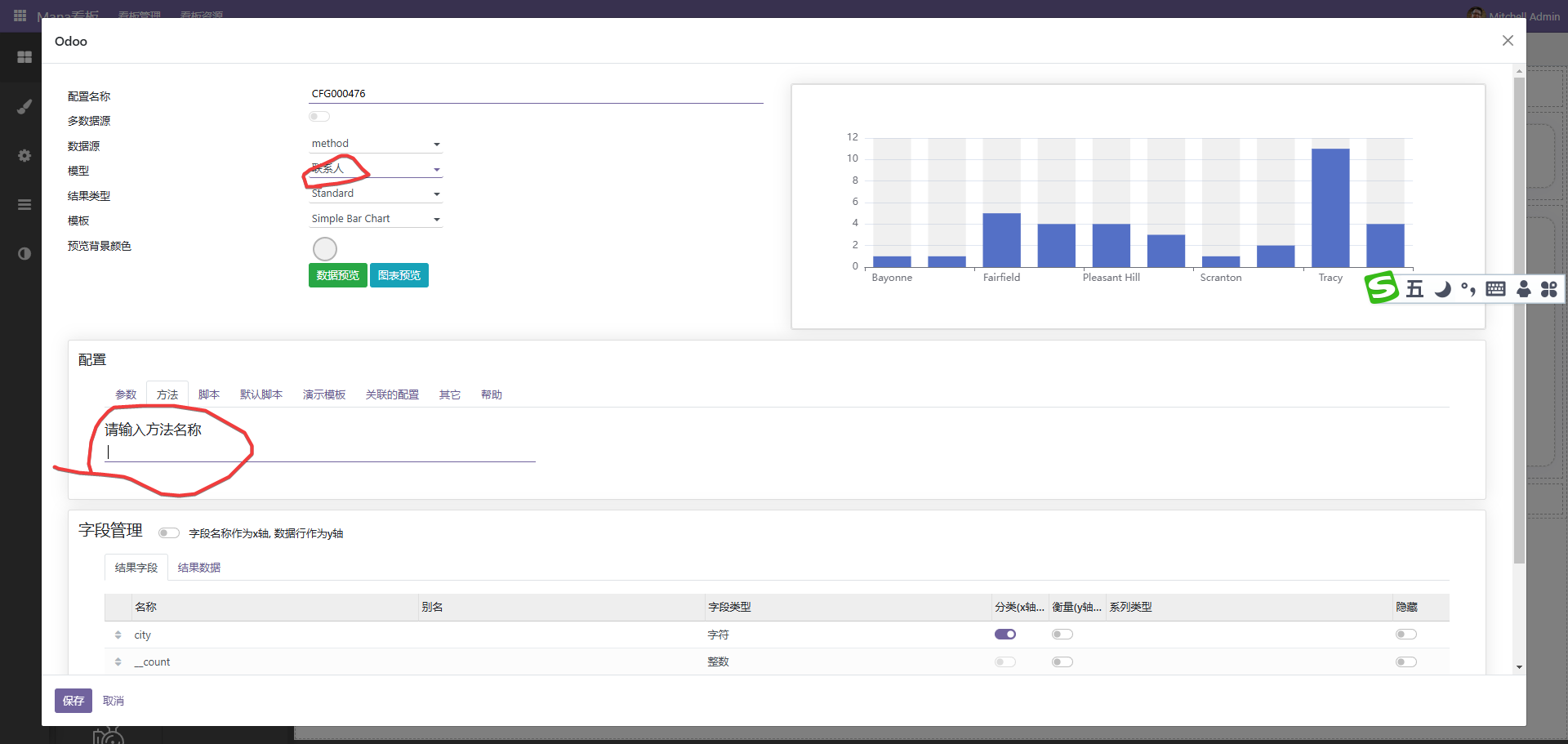
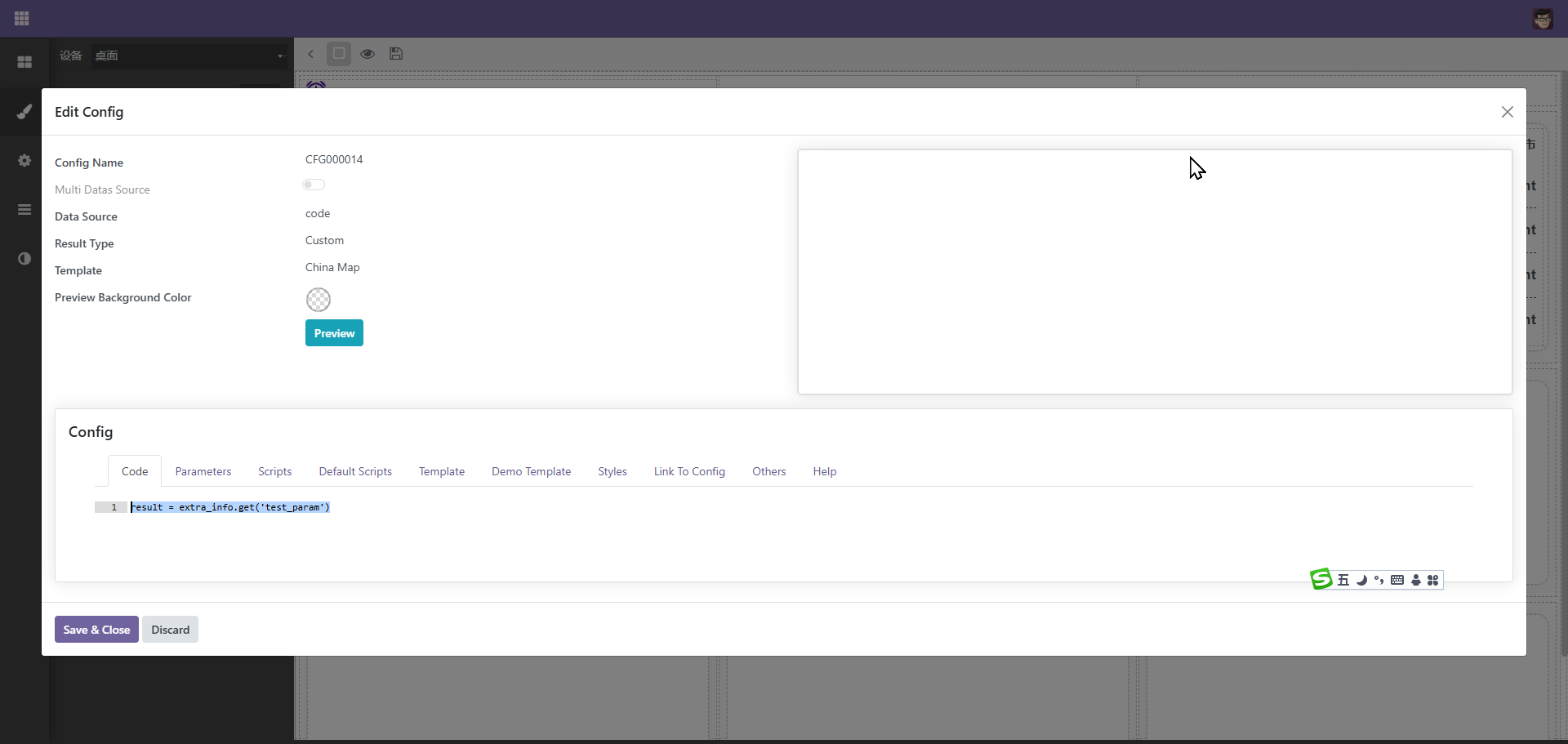
1、选择数据源,目前支持以下几种模式。
(1)、模型。
选择一个模型,同时在下方分组上选择分组的字段,注意,一些字段,如计算字段等无法进行分组。如上图。
[
    {
        product: "Matcha Latte",
        "2015": 43.3,
        "2016": 85.8,
        "2017": 93.7,
    },
    {
        product: "Milk Tea",
        "2015": 83.1,
        "2016": 73.4,
        "2017": 55.1,
    },
    {
        product: "Cheese Cocoa",
        "2015": 86.4,
        "2016": 65.2,
        "2017": 82.5,
    },
    {
        product: "Walnut Brownie",
        "2015": 72.4,
        "2016": 53.9,
        "2017": 39.1,
    },
]
(4)、python代码。
此方式可以直接写代码,调用整理后端数据。
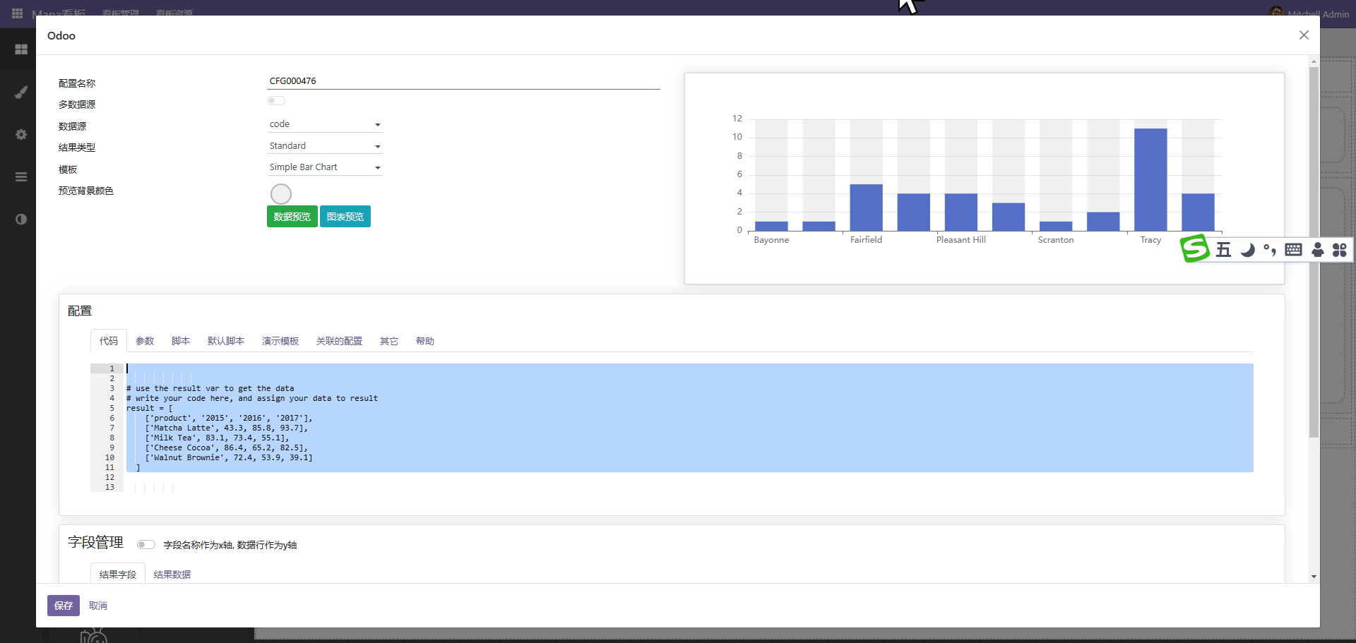
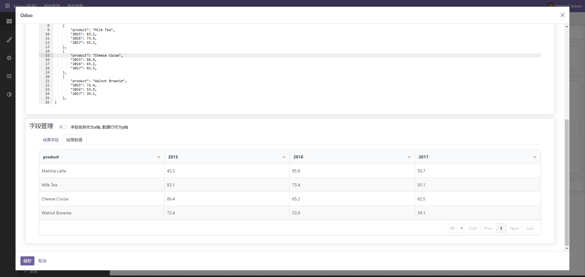
结果一定要通过result返回。可能通过self.env['xxxx'].method()的形式获取数据,最终通过result返回数据。
(5)、无。
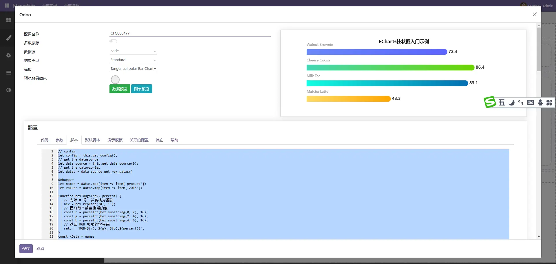
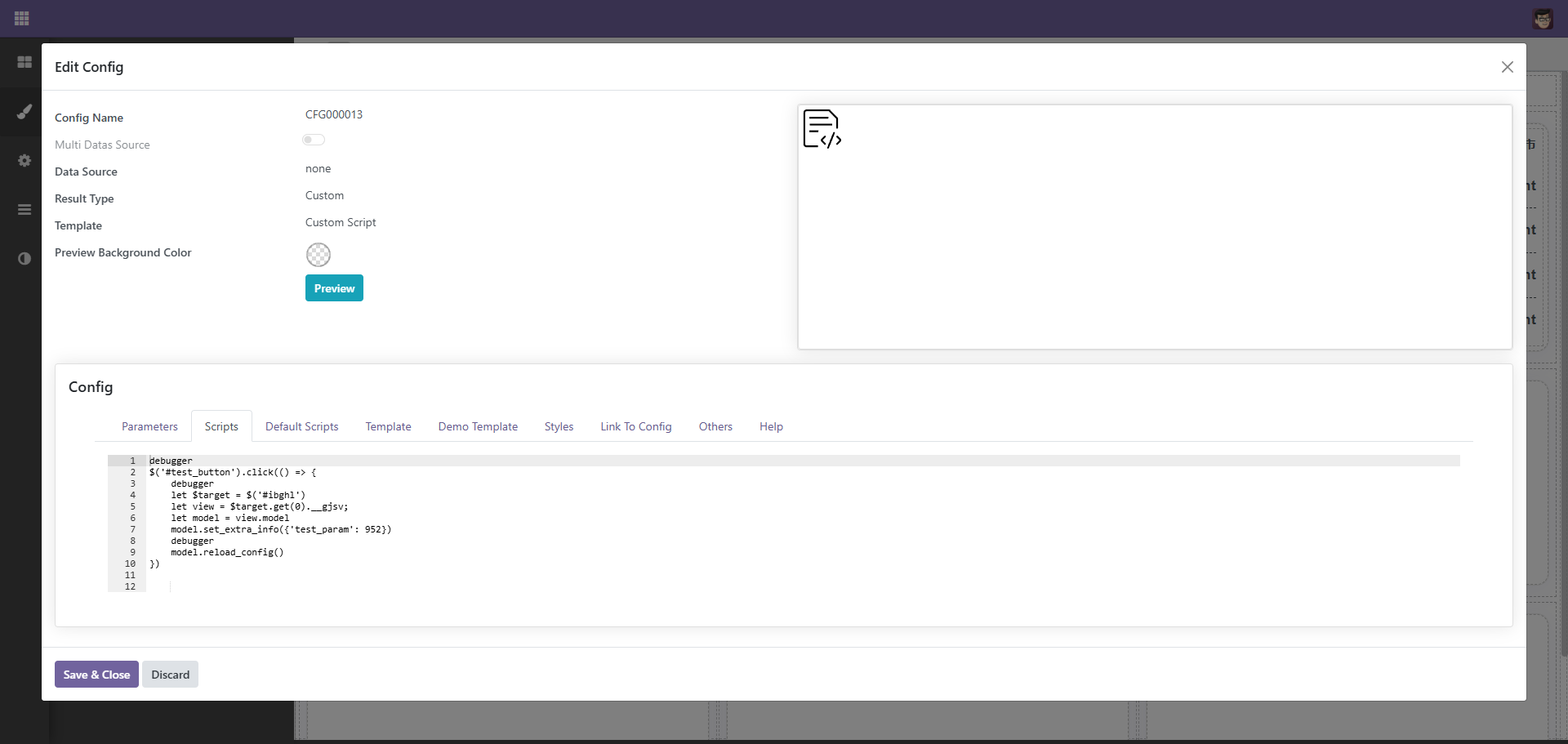
自定义图表
虽然内置了很多图表,但总有不满足的情况,通过自定义图表可以很好的解决此问题
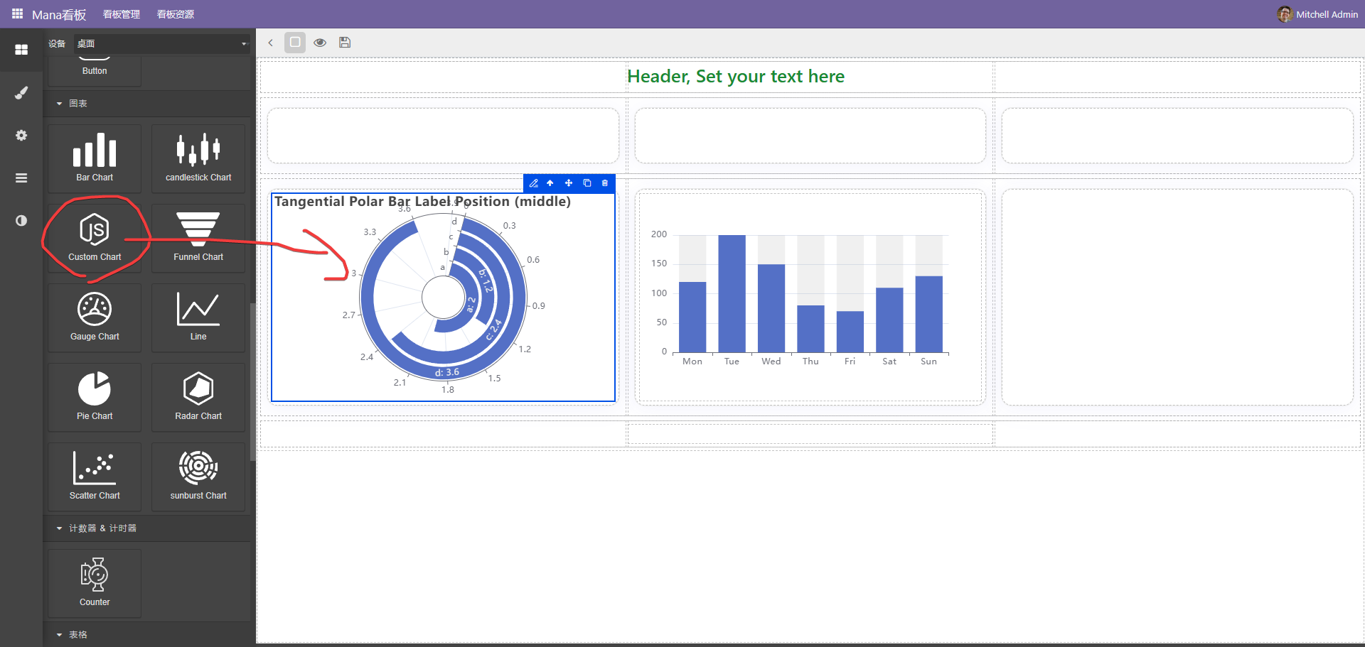
点击编辑按扭进入配置界面,此种方式一般使用code作为后端数据源
后端代码示例如下
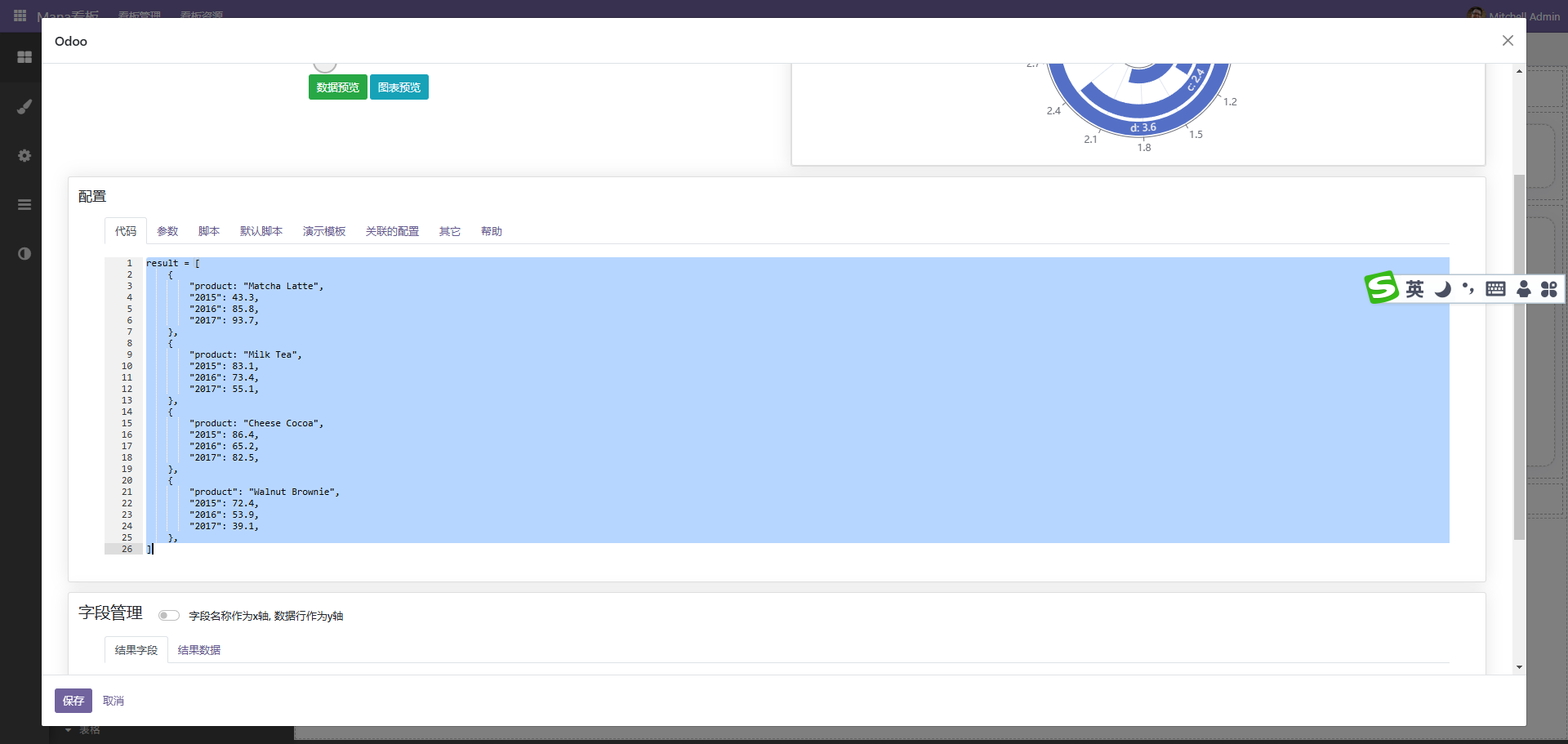
参考代码
result = [
    {
        "product: "Matcha Latte",
        "2015": 43.3,
        "2016": 85.8,
        "2017": 93.7,
    },
    {
        "product: "Milk Tea",
        "2015": 83.1,
        "2016": 73.4,
        "2017": 55.1,
    },
    {
        "product: "Cheese Cocoa",
        "2015": 86.4,
        "2016": 65.2,
        "2017": 82.5,
    },
    {
        "product": "Walnut Brownie",
        "2015": 72.4,
        "2016": 53.9,
        "2017": 39.1,
    },
]
function hexToRgb(hex, percent) {
// 去除 # 号,并转换为整数
hex = hex.replace('#', '');
// 提取每个颜色通道的值
const r = parseInt(hex.substring(0, 2), 16);
const g = parseInt(hex.substring(2, 4), 16);
const b = parseInt(hex.substring(4, 6), 16);
// 返回 RGB 格式的字符串
return `RGB(${r}, ${g}, ${b},${percent})`;
}
const xData = ['询价','竞争性磋商', '单一来源', '竞争性谈判','邀请招标','公开招标' ]
const yData = [234, 188, 315, 234, 188, 315]
const colorList = [
'#FFA600',
'#FEDB65',
'#026DB2',
'#12FEE0',
'#6DD400',
'#44D7B6',
'#5C64FF',
'#6988F8',
'#0E5FFF',
'#2DE1FD',
'#8221F1',
'#B26DF6',
]
option = {
title: {
text: 'ECharts柱状图入门示例',
left: "center",
top: "8%",
textStyle: {
color: '#111111', // 标题颜色
fontWeight: 'bold',
fontSize: 16,
},
},
tooltip: {
trigger: 'axis',
borderWidth: 0,
backgroundColor: 'rgba(0,0,0,0.75)',
color: '#fff',
textStyle: {
color: '#fff'
},
//避免出现多个信息
formatter: function (params) {
return params[0].name + `</br><span style="display:inline-block;width:10px;height:10px;border-radius:5px;background-color:${params[0].color.colorStops[0].color}"></span> ` + params[0].value; // 只显示第一个系列的信息
}
},
toolbox: {
show: true
},
grid: {
top: "15%",
bottom: "10%", //也可设置left和right设置距离来控制图表的大小
},
yAxis: [
{
data: xData,
axisLabel: {
show: false,
},
splitLine: {
show: false,
},
axisTick: {
show: false,
},
axisLine: {
show: false,
},
},
],
xAxis: {
show: true,
splitLine: {
show: false,
},
axisTick: {
show: true,
inside: true,
lineStyle: {
color: '#045d79'
}
},
axisLine: {
show: false,
lineStyle: {
color: '#045d79'
},
},
axisLabel: {
show: false,
// color: 'white' // 将 x 轴文字颜色改为白色
},
axisTick: {
show: false,
},
},
series: [
{
z: 1,
type: 'bar',
data: yData,
barWidth: 20,
zlevel: 1,
showBackground: false,
itemStyle: {
barBorderRadius: [0, 20, 20, 0], // 圆角(左上、右上、右下、左下)
color: function (params) {
var index = params.dataIndex + params.dataIndex;
//每个柱子单独颜色渐变 可多加几个渐变过程 colorStops[{},{},{}]
const colorStops = [{
offset: 1,
color: colorList[index]
}, {
offset: 0,
color: colorList[index + 1]
// color: lightenColor(colors[params.dataIndex], 0.5) // 使用 lightenColor 函数使颜色变浅
// color: hexToRgb(colorList[params.dataIndex % colorList.length], 0.2) // 使用 lightenColor 函数使颜色变浅
}];
return new echarts.graphic.LinearGradient(0, 0, 1, 0, colorStops)
},
},
label: {
normal: {
color: '#000',
show: true,
position: [0, '-20px'],
textStyle: {
fontSize: 12,
color: "#999999",
},
formatter: '{b}',
},
},
},
{
type: 'bar',
data: yData,
barWidth: 20,
barGap: '-100%',
itemStyle: {
normal: {
color: '#f5f8ff',
},
emphasis: {
color: '#f5f8ff',
},
},
label: {
normal: {
color: '#333333',
show: true,
position:'right',
distance: 4,
textStyle: {
fontSize: 14,
fontWeight: "bold"
},
formatter: '{c}',
},
},
},
],
//数据过多纵向滚动
dataZoom: [
{
type: 'inside', // 数据缩放
show: true,
yAxisIndex: 0, // 对应的y轴
start: 0,
end: yData.length > 10 ? 1000 / yData.length : 100 // 初始显示范围,根据需要调整
}
],
};
// config
let config = this.get_config();
// get the datasource
let data_source = this.get_data_source(0);
// get the catorgories
let datas = data_source.get_raw_datas()
// config
let config = this.get_config();
// get the datasource
let data_source = this.get_data_source(0);
// get the catorgories
let datas = data_source.get_raw_datas()

debugger
let names = datas.map(item => item['product'])
let values = datas.map(item => item['2015'])

function hexToRgb(hex, percent) {
   // 去除 # 号,并转换为整数
   hex = hex.replace('#', '');
   // 提取每个颜色通道的值
   const r = parseInt(hex.substring(0, 2), 16);
   const g = parseInt(hex.substring(2, 4), 16);
   const b = parseInt(hex.substring(4, 6), 16);
   // 返回 RGB 格式的字符串
   return `RGB(${r}, ${g}, ${b},${percent})`;
}
const xData = names
const yData = values
const colorList = [
   '#FFA600',
   '#FEDB65',
   '#026DB2',
   '#12FEE0',
   '#6DD400',
   '#44D7B6',
   '#5C64FF',
   '#6988F8',
   '#0E5FFF',
   '#2DE1FD',
   '#8221F1',
   '#B26DF6',
]
option = {
   title: {
      text: 'ECharts柱状图入门示例',
      left: "center",
      top: "8%",
      textStyle: {
         color: '#111111', // 标题颜色
         fontWeight: 'bold',
         fontSize: 16,
      },
   },
   tooltip: {
      trigger: 'axis',
      borderWidth: 0,
      backgroundColor: 'rgba(0,0,0,0.75)',
      color: '#fff',
      textStyle: {
         color: '#fff'
      },
      //避免出现多个信息
      formatter: function (params) {
         return params[0].name + `</br><span style="display:inline-block;width:10px;height:10px;border-radius:5px;background-color:${params[0].color.colorStops[0].color}"></span> ` + params[0].value; // 只显示第一个系列的信息
      }
   },
   toolbox: {
      show: true
   },
   grid: {
      top: "15%",
      bottom: "10%", //也可设置left和right设置距离来控制图表的大小
   },
   yAxis: [
      {
         data: xData,
         axisLabel: {
            show: false,
         },
         splitLine: {
            show: false,
         },
         axisTick: {
            show: false,
         },
         axisLine: {
            show: false,
         },
      },
   ],
   xAxis: {
      show: true,
      splitLine: {
         show: false,
      },
      axisTick: {
         show: true,
         inside: true,
         lineStyle: {
            color: '#045d79'
         }
      },
      axisLine: {
         show: false,
         lineStyle: {
            color: '#045d79'
         },
      },
      axisLabel: {
         show: false,
         // color: 'white' // 将 x 轴文字颜色改为白色
      },
      axisTick: {
         show: false,
      },
   },
   series: [
      {
         z: 1,
         type: 'bar',
         data: yData,
         barWidth: 20,
         zlevel: 1,
         showBackground: false,
         itemStyle: {
            barBorderRadius: [0, 20, 20, 0], // 圆角(左上、右上、右下、左下)
            color: function (params) {
               var index = params.dataIndex + params.dataIndex;
               //每个柱子单独颜色渐变 可多加几个渐变过程 colorStops[{},{},{}]
               const colorStops = [{
                  offset: 1,
                  color: colorList[index]
               }, {
                  offset: 0,
                  color: colorList[index + 1]
                  // color: lightenColor(colors[params.dataIndex], 0.5) // 使用 lightenColor 函数使颜色变浅
                  // color: hexToRgb(colorList[params.dataIndex % colorList.length], 0.2) // 使用 lightenColor 函数使颜色变浅
               }];
               return new echarts.graphic.LinearGradient(0, 0, 1, 0, colorStops)
            },
         },
         label: {
            normal: {
               color: '#000',
               show: true,
               position: [0, '-20px'],
               textStyle: {
                  fontSize: 12,
                  color: "#999999",
               },
               formatter: '{b}',
            },
         },
      },
      {
         type: 'bar',
         data: yData,
         barWidth: 20,
         barGap: '-100%',
         itemStyle: {
               normal: {
                  color: '#f5f8ff',
               },
               emphasis: {
                  color: '#f5f8ff',
               },
         },
         label: {
               normal: {
                  color: '#333333',
                  show: true,
                  position:'right',
                  distance: 4,
                  textStyle: {
                     fontSize: 14,
                     fontWeight: "bold"
                  },
                  formatter: '{c}',
               },
         },
      },
   ],
   //数据过多纵向滚动
   dataZoom: [
      {
         type: 'inside', // 数据缩放
         show: true,
         yAxisIndex: 0, // 对应的y轴
         start: 0,
         end: yData.length > 10 ? 1000 / yData.length : 100  // 初始显示范围,根据需要调整
      }
   ],
};

this.set_option(option)

如此便可以大量使用第三方图表。
自定义列表
由于系统自带的列表颜色等不好控制,所以大多数时候我们还需要自定义列表,并且,很多时候,列表是需要配合marquee(跑马灯进行滚动),自先拖动一个自定义列表或是qweb组件到内容区域中
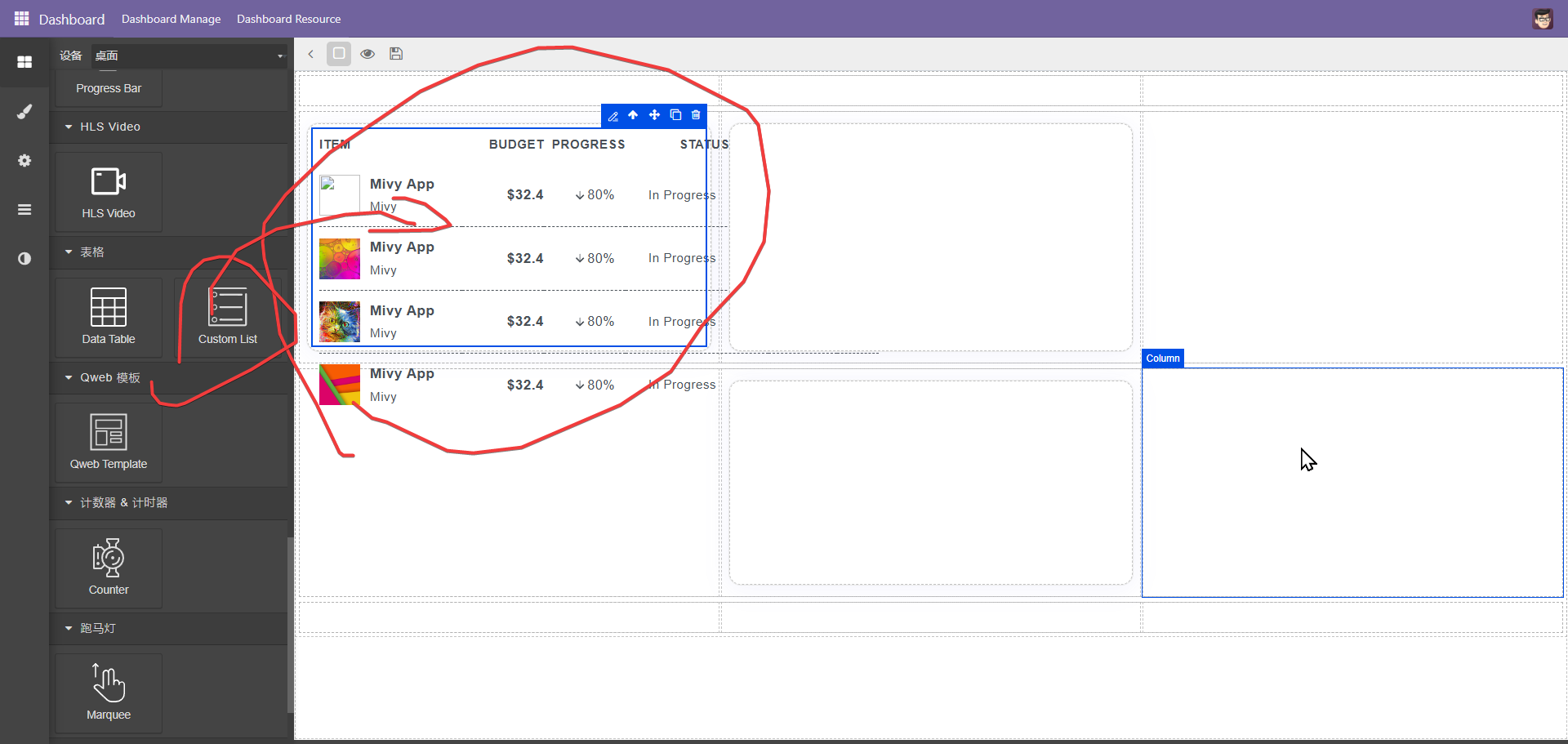
点击编辑按扭, 这里以json数据源为例
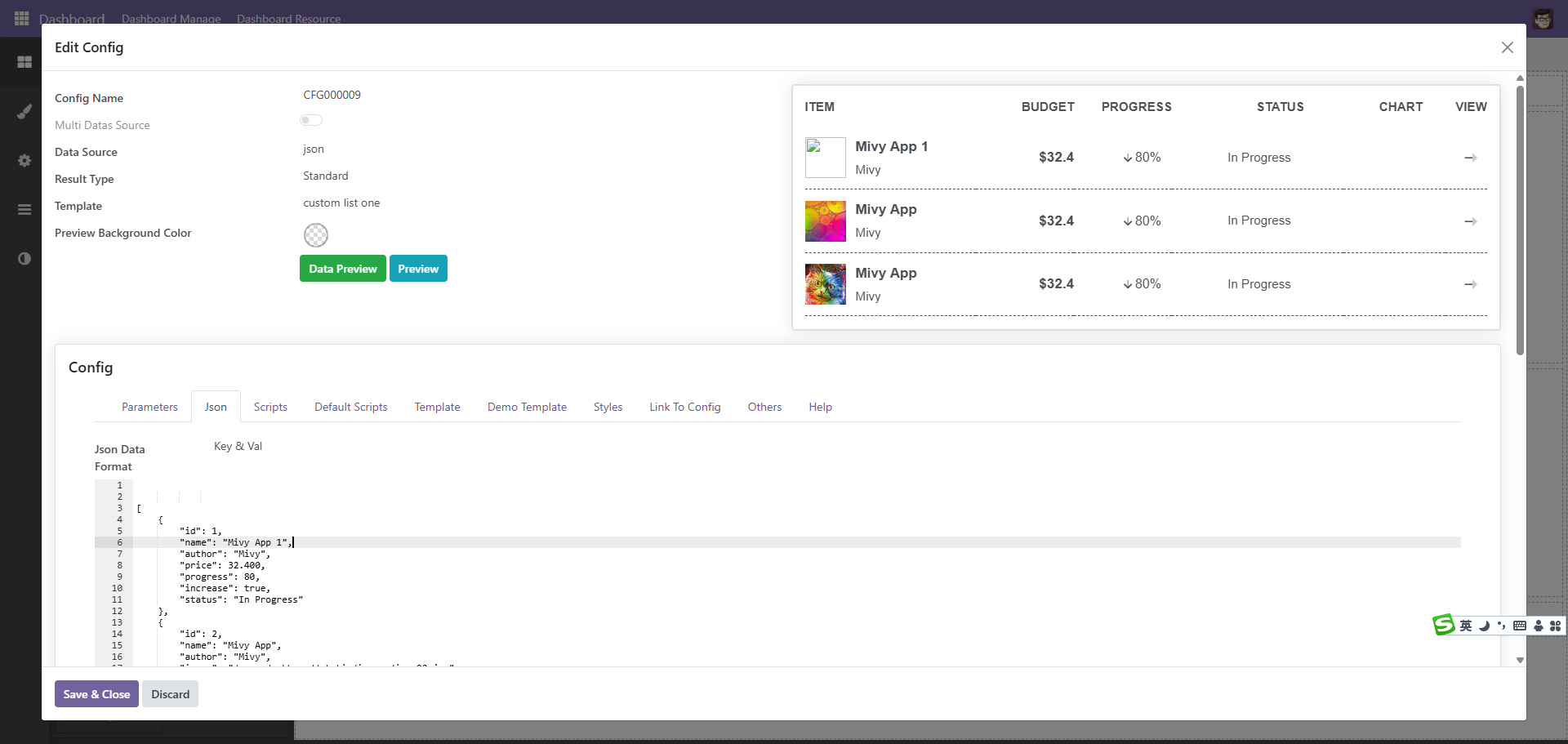
数据内容为, 如果是自定义函数或是python的方式,也是返回同样格式的内容
[
    {
        "id": 1,
        "name": "Mivy App 1",
        "author": "Mivy",
        "price": 32.400,
        "progress": 80,
        "increase": true,
        "status": "In Progress"
    },
    {
        "id": 2,
        "name": "Mivy App",
        "author": "Mivy",
        "image": "/mana_dashboard/static/images/img-02.jpg",
        "price": 32.400,
        "progress": 80,
        "increase": true,
        "status": "In Progress"
    },
    {
        "id": 3,
        "name": "Mivy App",
        "author": "Mivy",
        "image": "/mana_dashboard/static/images/img-03.jpg",
        "price": 32.400,
        "progress": 80,
        "increase": true,
        "status": "In Progress"
    },
    {
        "id": 4,
        "name": "Mivy App",
        "author": "Mivy",
        "image": "/mana_dashboard/static/images/img-04.jpg",
        "price": 32.400,
        "progress": 80,
        "increase": true,
        "status": "In Progress"
    }
]
数据有了以便是处理模板,模板使用qweb的方式,目前没有使用owl,后续使用owl进行渲染
<!--begin::Table-->
<table class="table table-row-dashed align-middle gs-0 gy-3 my-0">
<!--begin::Table head-->
<thead>
<tr class="fs-7 fw-bold text-gray-400 border-bottom-0">
<th class="p-0 pb-3 min-w-175px text-start">ITEM</th>
<th class="p-0 pb-3 min-w-100px text-end">BUDGET</th>
<th class="p-0 pb-3 min-w-100px text-end">PROGRESS</th>
<th class="p-0 pb-3 min-w-175px text-end pe-12">STATUS</th>
<th class="p-0 pb-3 w-125px text-end pe-7">CHART</th>
<th class="p-0 pb-3 w-50px text-end">VIEW</th>
</tr>
</thead>
<!--end::Table head-->
<!--begin::Table body-->
<tbody>
<t t-set="data_source" t-value="config.get_data_source(0)" />
<t t-set="records" t-value="data_source && data_source.datas || []" />
<tr t-foreach="records" t-as="record" t-key="record.id">
<td>
<div class="d-flex align-items-center">
<div class="symbol symbol-50px me-3">
<img alt="" t-att-src="record.image" />
</div>
<div
class="d-flex justify-content-start flex-column">
<a class="text-gray-800 fw-bold text-hover-primary mb-1 fs-6"
href="#"><t t-esc="record.name" /></a>
<span class="text-gray-400 fw-semibold d-block fs-7"><t t-esc="record.author" /></span>
</div>
</div>
</td>
<td class="text-end pe-0">
<span class="text-gray-600 fw-bold fs-6">$<t t-esc="record.price" /></span>
</td>
<td class="text-end pe-0">
<!--begin::Label-->
<span class="badge badge-light-danger fs-base">
<!--begin::Svg Icon | path: icons/duotune/arrows/arr065.svg-->
<span class="svg-icon svg-icon-5 svg-icon-danger ms-n1">
<svg t-if="record.increase"
xmlns="http://www.w3.org/2000/svg"
fill="none" viewBox="0 0 24 24"
width="24" height="24">
<rect opacity="0.5" fill="currentColor"
transform="rotate(-90 11 18)" x="11"
y="18" width="13" height="2"
rx="1" />
<path fill="currentColor"
d="M 11.4343 15.4343 L 7.25 11.25 C 6.83579 10.8358 6.16421 10.8358 5.75 11.25 C 5.33579 11.6642 5.33579 12.3358 5.75 12.75 L 11.2929 18.2929 C 11.6834 18.6834 12.3166 18.6834 12.7071 18.2929 L 18.25 12.75 C 18.6642 12.3358 18.6642 11.6642 18.25 11.25 C 17.8358 10.8358 17.1642 10.8358 16.75 11.25 L 12.5657 15.4343 C 12.2533 15.7467 11.7467 15.7467 11.4343 15.4343 Z" />
</svg>
<svg t-else="" data-gjs-type="svg" xmlns="http://www.w3.org/2000/svg" fill="none" viewBox="0 0 24 24" width="24" height="24"><rect id="iiamst" data-gjs-type="svg-in" opacity="0.5" fill="currentColor" transform="rotate(-90 11 18)" x="11" y="18" width="13" height="2" rx="1"></rect><path id="iyk15x" data-gjs-type="svg-in" fill="currentColor" d="M 11.4343 15.4343 L 7.25 11.25 C 6.83579 10.8358 6.16421 10.8358 5.75 11.25 C 5.33579 11.6642 5.33579 12.3358 5.75 12.75 L 11.2929 18.2929 C 11.6834 18.6834 12.3166 18.6834 12.7071 18.2929 L 18.25 12.75 C 18.6642 12.3358 18.6642 11.6642 18.25 11.25 C 17.8358 10.8358 17.1642 10.8358 16.75 11.25 L 12.5657 15.4343 C 12.2533 15.7467 11.7467 15.7467 11.4343 15.4343 Z"></path></svg>
</span>
<!--end::Svg Icon-->
<t t-esc="record.progress" />%
</span>
<!--end::Label-->
</td>
<td class="text-end pe-12">
<span class="badge py-3 px-4 fs-7 badge-light-primary"><t t-esc="record.status" /></span>
</td>
<td class="text-end pe-0">
<div class="h-50px mt-n8 pe-7" data-kt-chart-color="danger"></div>
</td>
<td class="text-end">
<a class="btn btn-sm btn-icon btn-bg-light btn-active-color-primary w-30px h-30px"
href="#">
<!--begin::Svg Icon | path: icons/duotune/arrows/arr001.svg-->
<span class="svg-icon svg-icon-5 svg-icon-gray-700"><svg
xmlns="http://www.w3.org/2000/svg"
fill="none" viewBox="0 0 24 24"
width="24" height="24">
<path fill="currentColor"
d="M 14.4 11 H 3 C 2.4 11 2 11.4 2 12 C 2 12.6 2.4 13 3 13 H 14.4 V 11 Z" />
<path opacity="0.3" fill="currentColor"
d="M 14.4 20 V 4 L 21.7 11.3 C 22.1 11.7 22.1 12.3 21.7 12.7 L 14.4 20 Z" />
</svg>
</span>
<!--end::Svg Icon-->
</a>
</td>
</tr>
</tbody>
<!--end::Table body-->
</table>
渲染模板时,系统会自动带入config,通过config的函数调用系统传入的数据
<t t-set="data_source" t-value="config.get_data_source(0)" />
<t t-set="records" t-value="data_source && data_source.datas || []" />
<tr t-foreach="records" t-as="record" t-key="record.id">
/web/content/<string:model>/<int:id>/<string:field>
数据也可以通过上下文的方式传入,形式如下
let config = this.get_config()
let data_source = config.get_data_source(0)
let records = data_source.get_raw_datas()

this.render_template({
    records: records
});
模板中语法也是相同,同理,如果是使用qweb的方式也是如此,列表本质上也是qweb组件。需要注意的是,这种方式只适合固定列表,跑马灯因为需要顶部固定,所以需要把两个表格拼接以后,上面部份固定,下面部份滚动。
上面是使用json数据的形式,下面使用模型的形式如下
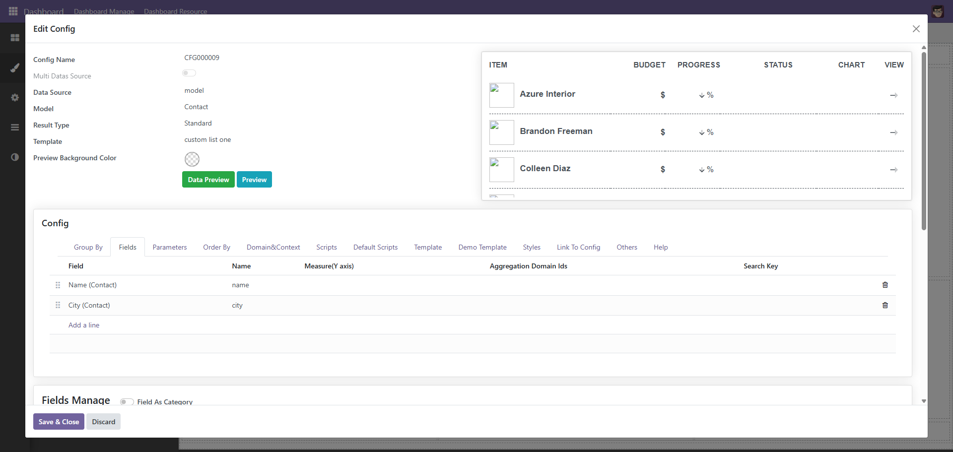
选择模型以后选择字段,js脚本如下
let config = this.get_config()
let data_source = config.get_data_source(0)
let records = data_source.get_raw_datas()

this.render_template({
    records: records
});
xml代码如下
    <!--begin::Table-->
    <table class="table table-row-dashed align-middle gs-0 gy-3 my-0">
        <!--begin::Table head-->
        <thead>
            <tr class="fs-7 fw-bold text-gray-400 border-bottom-0">
                <th class="p-0 pb-3 min-w-175px text-start">名称</th>
                <th class="p-0 pb-3 min-w-100px text-end">城市</th>
            </tr>
        </thead>
        <!--end::Table head-->

        <!--begin::Table body-->
        <tbody>
            <tr t-foreach="records" t-as="record" t-key="record.id">
                <td>
                    <div class="d-flex align-items-center">

                        <div
                            class="d-flex justify-content-start flex-column">
                            <a class="text-gray-800 fw-bold text-hover-primary mb-1 fs-6"
                                href="#"><t t-esc="record.name" /></a>
                        </div>
                    </div>
                </td>

                <td class="text-end pe-0">
                    <span class="text-gray-600 fw-bold fs-6">$<t t-esc="record.city" /></span>
                </td>
            </tr>
        </tbody>
        <!--end::Table body-->
    </table>
显示效果如下

当然,也可以使用python代码的形式
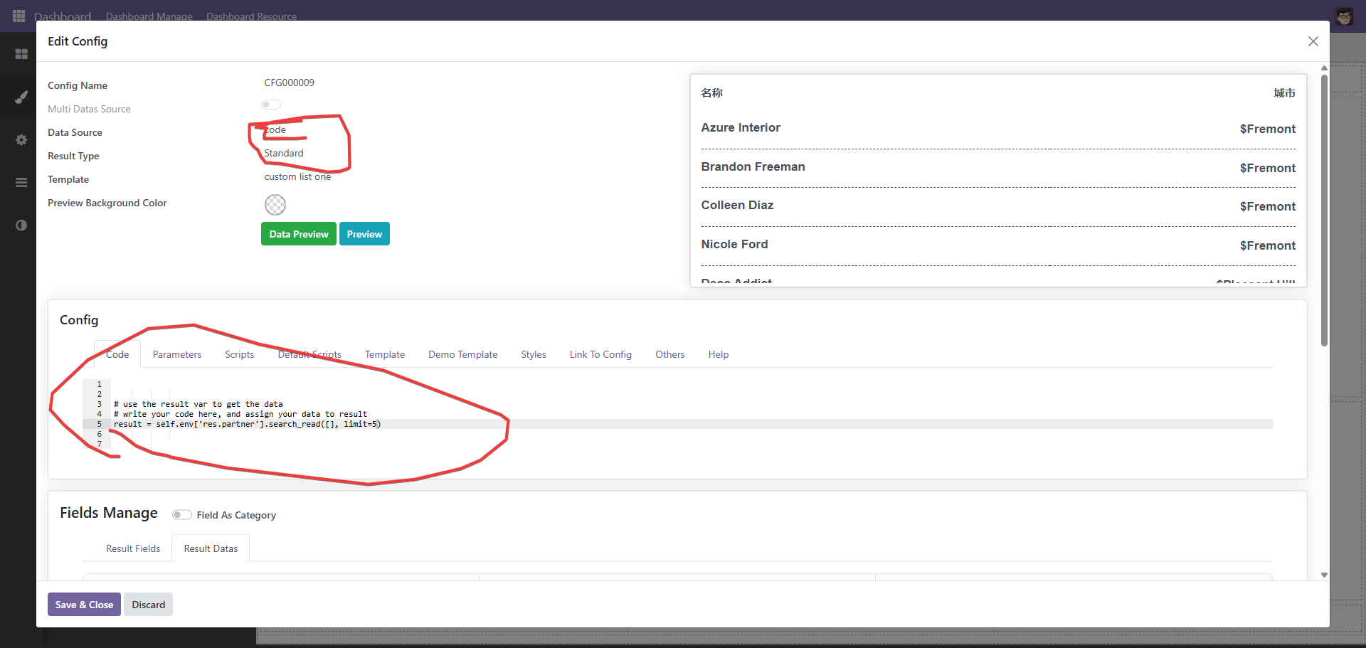
# use the result var to get the data
# write your code here, and assign your data to result
result = self.env['res.partner'].search_read([], limit=5)
跑马灯效果
由于空间等原因,很多时候我们需要以滚动的形式呈现效果
函数传参
大屏难免自定义的时候,这个时候便需要传递参数,主要是下面两种情况
1、搜索。
2、联动。
当然,也可能是其它一些更复杂的情况,传参的核心原理是,系统在调用函数时,会将相关的上下文传递过去,代码如下
    @api.model    def get_data_from_code(self, code, extra_context={}, get_field_infos=True):        """        get data from python code        """        if not code:            return {                'datas': [],                'field_infos': [],            }
        eval_context = self._get_eval_context()        eval_context.update(extra_context)        if 'params' not in eval_context:            eval_context['params'] = Box(eval_context.get('params', {}))
搜索通过上下文中的search_info获取,其它的通过param中去获取
    def get_extra_context(self, options={}):        """        get extra context        """        search_infos = options.get('search_infos', [])        context = {            'search_infos': search_infos,            'offset': options.get('offset', None),            'limit': options.get('limit', None),        }
        # mearge params value        params_dict = self.parameter_ids.get_parameters()
        for search_info in search_infos:
            key = search_info.get('key')            if not key:                continue
            apply_to_param = search_info.get('apply_to_params')            if not apply_to_param:                continue
            type = search_info.get('type')            if type == 'datetime_range':                params_dict[key] = {                    'start': search_info.get('start'),                    'end': search_info.get('end')                }            else:                value = search_info.get('value')                if key in params_dict:                    params_dict[key]['value'] = value                else:                    params_dict[key] = {                        'value': value,                        'type': type,                    }
        # box to use the dot notation        context['params'] = Box(params_dict)        context['search_infos'] = search_info        return context
操作其它元素
生产中,难免出会现操作其它元素的情况
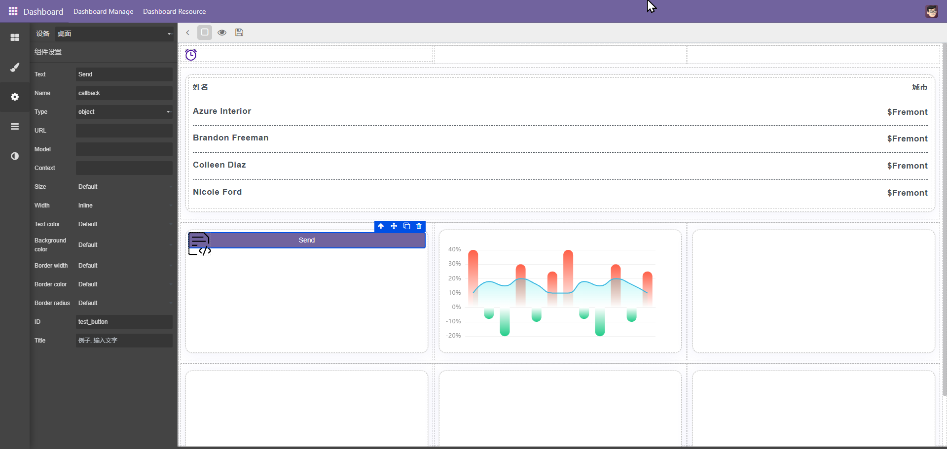
以上图为例,当点击按扭时,需传递参数给图表二,此时配合脚本模块
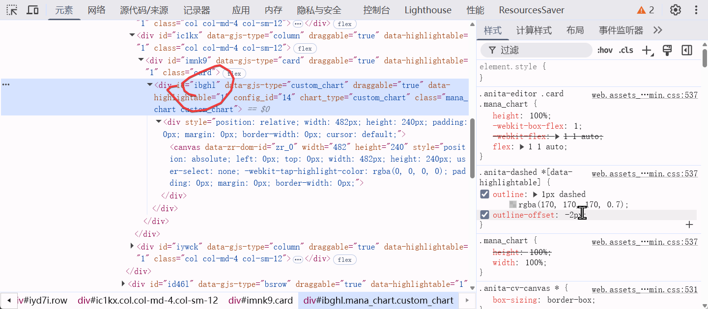
脚本如下
$('#test_button').click(() => {
    debugger
    let $target = $('#ibghl')
    let view = $target.get(0).__gjsv;
    let model = view.model
    model.set_extra_info({'test_param': 952})
})
这里,view用于取得视图对象,可以通过视图调用视图相关的方法,如重新渲染等,通过view的model可以取得model对象,设置model的extra_info可以设置额外的参数,设置后系统会重新加载taget数据,在后端通过
result = extra_info.get('test_param')便可以取得前端传递的参数,通过这样的方式达到控制其它元素的目的